With a single update, OnePlus ruined OxygenOS for me
OnePlus commits the cardinal sin of fixing something that wasn't broken in the first place.
The first OxygenOS 11 preview is now available, and there's a lot to take in. Recent updates to OxygenOS have focused on feature additions, with the core UI remaining unchanged for a few generations. But with OxygenOS 11, OnePlus is introducing a new design that's similar to Samsung's One UI, with the brand signaling a shift away from the stock Android UI that set OxygenOS apart over the last four years.
Without burying the lede, I don't like the changes one bit. I'm not bashing OnePlus just for the sake of it; I choose to use OnePlus devices for a majority of the year because of the clean software. OnePlus did a magnificent job of offering a clutter-free interface that had its roots in stock Android, and that's what attracted a lot of enthusiasts to the brand. When Google ditched the Nexus program, OnePlus devices became the de facto alternative because of the software and value on offer.
That's why it's frustrating to see the direction the manufacturer is taking with OxygenOS 11. The crux of the issue is that the new visual layout deviates a lot from the stock look and feel of earlier versions of OxygenOS, with the changes affecting a lot of the core UI elements. The notification panel is unchanged, but that may not be the case in future releases as OnePlus asserts its own visual identity.
At its core, OxygenOS managed to strike the ideal balance between simplicity and customizability, with the skin appealing to both novice users and enthusiasts alike. Unlike Samsung's One UI, you didn't have to fiddle around with a thousand settings to get OxygenOS set up to your liking, but if you needed powerful customization options, the skin had plenty to offer.
If you like a stock Android interface, you'll have to look elsewhere.
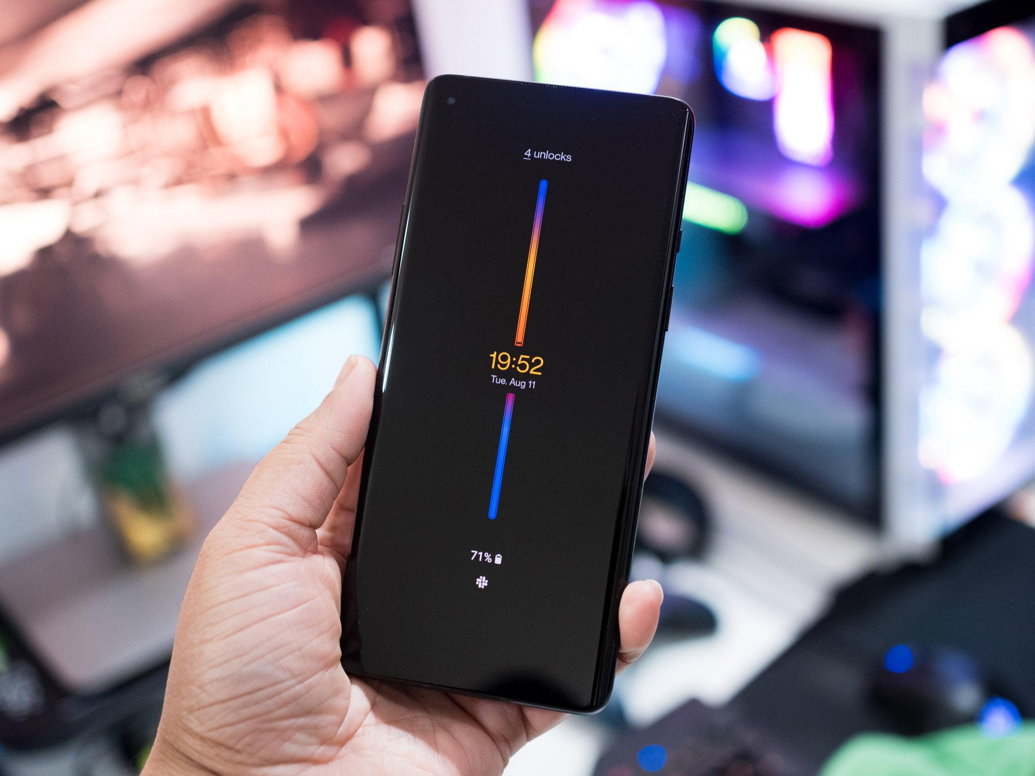
With OxygenOS 11, that balance has shifted. The Samsung-ificiation of the software extends to the inconsistent UX, with no coherent design aesthetic to the skin as a whole. I just don't like the comically large headers or the increased font size, the gallery app has a tabbed interface that's different to the dialer, and the weather client just looks bad with the oversized text. At the end of the day, the controversial design changes overshadow the new feature additions like always-on display.
The worst part is that OnePlus didn't steal any of the standout features in One UI, like floating windows or a one-handed mode that's easy to use. Instead, it just emulated the design, and did a poor job at that. OnePlus has limited engineering resources, and it could have diverted them to fixing the camera inconsistencies on its phones instead.
So where does that leave you if you've been using OnePlus phones because of the clean software? Your best options are Motorola and HMD Global, but given the state of Motorola's software updates, you're better off with the latter. The recent $230 million investment from Google and Qualcomm into HMD will see the Finnish manufacturer roll out more phones, particularly in the U.S.
With a single version update, OnePlus undid a lot of the good work it put into OxygenOS over the last four years. It's clear that the manufacturer is paving the path for its own visual identity when it comes to the software, and that means you'll have to find another brand if you value a clean software interface. As for me, I just became much more interested in the Nokia 8.3.
Get More OnePlus 8
OnePlus 8 & 8 Pro

from Android Central - Android Forums, News, Reviews, Help and Android Wallpapers https://ift.tt/2PR9dec
via IFTTT


No comments: